Layouts / Responsive Design

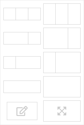
The content of views is structured using one or more layouts. A layout consists of one, two or 3 areas that contain the vizuals.
Via the 'Add layout' button in the header area, within the edit mode, the layout selection is opened (see picture).
The grid of layout areas has a width of 400 pixels with a maximum of 3 areas next to each other, giving a total of 1200 pixels. Exceptions are the special layout types.
Layouts can be deleted via the button and relocated via by drag & drop.
Responsive Design
Layouts that consist of multiple areas are responsive and wrap on mobile devices. In AnyViz, the viewport width on mobile devices is fixed at 400 pixels. Thus, a layout consisting of 3 areas is fully responsive.
Within an area, the vizuals are positioned absolutely and are not responsive. An exception is the full-screen layout, which adapts exactly to the screen size.
Individual layouts can optionally be hidden for mobile devices or for desktop devices .
Special layout types
- Custom layout: Any width and height can be specified.
- Full-screen layout: Can contain only one vizual that automatically adopts to the width and height of the screen.
Not all vizuals are accepted. Recommended for Visu / HTTP routing
When using one of these two layout types, no other layouts can be added in the view.